
MECO Motorsports
Complete digital presence for India's premier motorsport organisation — designed from a 3-colour brief (red, black, white) into a full visual system, 33 screens across 10+ page types, and React.js implementation live at mecomotorsports.co.in.
My Role
Sole Designer + Sole Frontend Engineer
Duration
2–3 months
Year
2023
Tools
Figma · FigJam · React.js · Material UI
Project Brief
Design and build the complete digital presence for India's premier motorsport organisation from scratch — visual identity system, 33 production screens across 10+ page types, and full React.js frontend implementation shipped to a live domain.
Complete digital presence for India's premier motorsport organisation — designed from a 3-colour brief (red, black, white) into a full visual system, 33 screens across 10+ page types, and React.js implementation live at mecomotorsports.co.in.
The Problem
India's biggest motorsports company. No digital home. Sponsors, fans, and race participants had nowhere to go — and the brand looked like it.
MECO owned premier racing tracks, organised national championships, and managed top racing teams — but their digital presence was PDFs, Instagram posts, and email blasts. Potential sponsors couldn't find event details. Participants couldn't register online. The brand didn't match the product.
No unified digital presence
Event details were split across 5 channels — Facebook, PDFs, WhatsApp, email, and a broken website from 2+ years ago.
Sponsor acquisition was manual
Sponsorship packages went out as Word documents via email. No online portfolio, no credibility anchor for potential sponsors.
Brand didn't communicate premium
Existing visuals were inconsistent and didn't reflect the scale of MECO's national championships.
Multi-audience, one channel
Racers, parents of junior drivers, corporate event bookers, and media all needed different information — pushed through Instagram.
UX Audit
What was broken before we redesigned
A heuristic evaluation of the existing system identified these critical issues before any design decisions were made.
Broken site, 2+ years old
The existing MECO website was non-functional and had no mobile layout — not updated since before the company's national expansion.
Digital PresenceNo sponsor anchor online
Potential sponsors received Word documents. No online track record, no event history visible at a URL.
ConversionInconsistent brand identity
4 different logo versions in circulation. No typography system, no documented brand colours.
Brand SystemOur approach: Build a brand experience — not just a website
Started by establishing a visual language from the 3-colour brief (red, black, white) — tyre tread motifs, chevron CTAs, racing flag grid elements, speed-motion typography. Structured the site around 3 audiences: racers (events/registration), corporates (tracks/booking), and media (press/gallery). 33 screens. 10+ page types. React.js. Live.
Process & Approach
How I approached the challenge
Domain Research
Self-directed research into MECO's event history, Indian motorsport calendar, and international motorsport sites (F1, MRF, FMSCI). No precedent at the agency for this domain.
Visual Language Design
Brand system from 3-colour brief: tyre tread grid backgrounds, chevron CTAs, racing flag border elements, speed-motion typography. V1 delivered and iterated to V2.
Multi-Audience IA
Site architecture for 4 audiences: racing enthusiasts (events/results), parents of junior drivers (academy/safety), corporate bookers (tracks/events), media (press/gallery).
33 Screens, 10+ Pages
Homepage, About, Academy (Karting + Racing), Team, Tracks (3 facilities + pricing), Products (6 sub-pages), Events, Gallery, Documentary, Press Release, Contact.
React Implementation
Sole frontend engineer. React.js + Material UI + custom CSS animations. Counter animations, sliding hero banners, animated newsfeed, micro-interactions. Shipped to mecomotorsports.co.in.
Design Principles
Brand first. Website second. Racing speed always.
A motorsports brand that looks slow online has already lost. Every decision communicated speed, prestige, and credibility.
First impression = authority
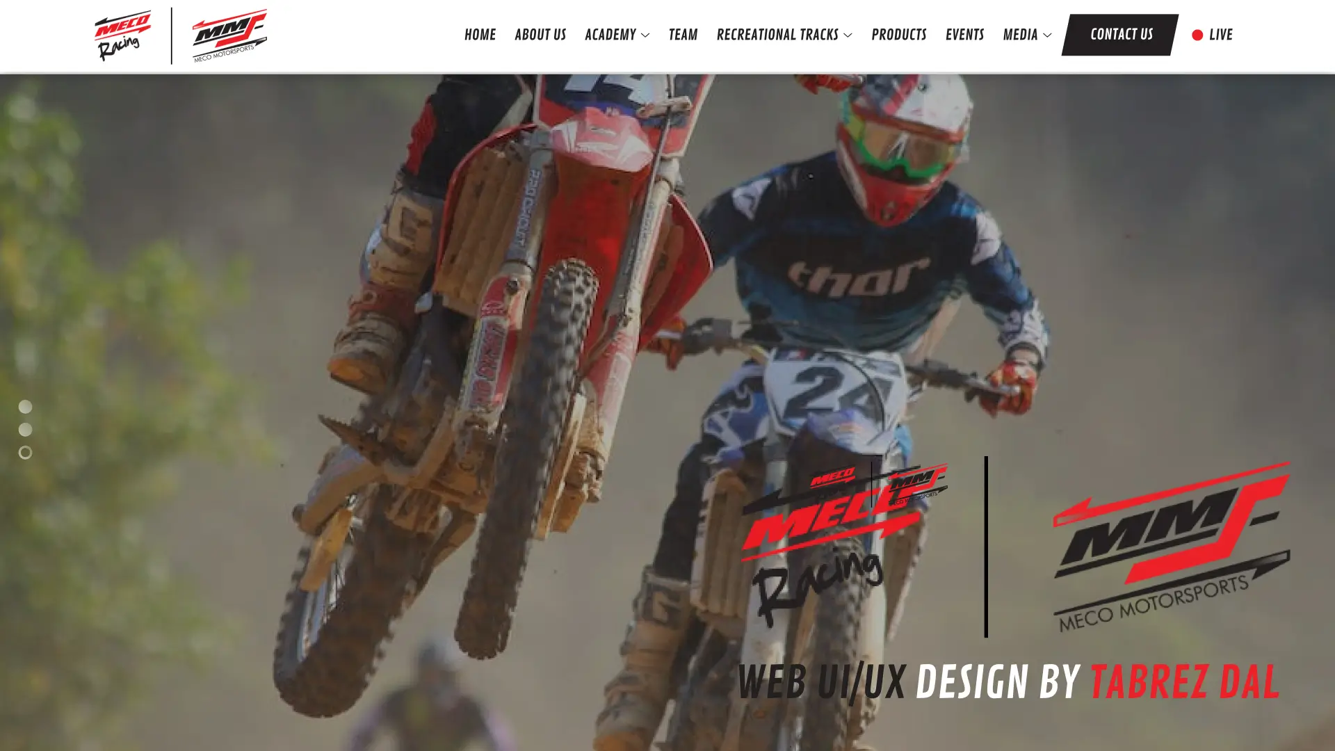
The hero section had one job: make MECO look like the most credible motorsports brand in India within 3 seconds. Dark, cinematic, large typography.
Conversion over content
Every page had a single primary CTA. Sponsor page → Contact. Events → Register. Tracks → Visit. No page was built just to have content.
Domain research before brief
No motorsport web precedent at the agency meant building the brief from domain research. The chevron motifs and tyre tread grids came from studying the sport, not the client doc.
V1 to V2 without scope extension
Client brief evolved mid-project. V1 delivered then revised to V2 — refined typography, enhanced animation system — within the original timeline.
A motorsports brand that looks slow online is already losing. Every pixel should communicate speed.
Why This Was Hard
Complexity signals
What set this project apart from standard product design work — the technical, systemic, and domain-specific challenges that demanded real depth.
Multi-audience single-site architecture
Racers, parents, corporate event bookers, and media — all landing on the same site. IA serves each without fragmenting the experience.
Greenfield with no domain precedent
No existing site, no brand assets, no motorsport web precedent at the agency. Every visual element came from domain research — tyre tread motifs, chevron CTAs, racing flag grids.
Design-to-production in one role
Sole designer and sole React engineer. Figma and the codebase stayed in sync with no handoff gap — every component-level design decision mapped directly to implementation.
V1 to V2 without timeline extension
Client brief evolved mid-project. V1 delivered then revised to V2 with refined typography, enhanced animation, and restructured event pages — within the original timeline.
One person. No domain precedent. 33 screens designed and shipped to a live production domain.
Before & After
Design transformation
Side-by-side comparison of the original state vs the redesigned experience.
Homepage — Design Evolution
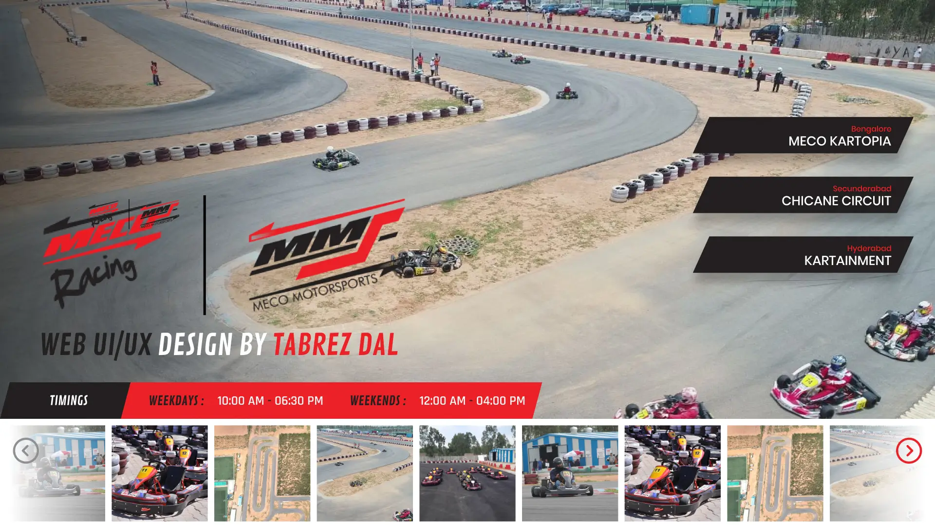
V1 Concept — bold typography, dark-first aesthetic, speed-kinetic visual language.
V2 Final — refined layout, cinematic hero, enhanced animation system, production-ready.
UI Screens
V1 → V2 design evolution
Two complete design phases — concept exploration to production-ready final.
Feature Highlights
What was built
Cinematic Hero Section
Full-bleed dark hero with speed-motion typography and high-contrast CTA — communicates authority instantly.
Visual DesignEvents & Championships Hub
Structured event listing replacing scattered PDFs and social posts — race calendar, results, and standings.
Content ArchitectureSponsorship Section
Tiered sponsorship packages as a scannable comparison — designed to convert on first scroll without a PDF send.
Conversion DesignRacing Academy Pages
Karting and racing programme pages with age groups, safety information, and enrolment CTAs for parents and junior driver prospects.
Audience DesignDesign System
Tokens, typography & components
A shared token-based system built to ensure consistency across every screen and state.
Color Tokens
Type Scale
Components
User Flow
Corporate sponsor journey
Homepage
Brand intro
Events
Race calendar
Championship
Standings
Sponsorship
Tier comparison
Contact
CTA conversion
Tech Stack
Tools & technologies
Design
Frontend
 React.js
 Material UI
 JavaScript
 CSS3
CSS3My Contribution
One person. All of it.
01
Sole Visual Designer
Brand system from 3-colour brief, visual language, tyre tread motifs, chevron CTAs, speed-motion typography. V1 concept through V2 final production design.
02
Sole Frontend Engineer
Full React.js + Material UI implementation. Counter animations, sliding hero, animated newsfeed, micro-interactions. Shipped to mecomotorsports.co.in.
Impact & Performance
Project at a glance
33
Screens designed
10+
Page types
2
Design phases
Live
Status
Timeline
2–3 months from brief to live domain
Week 1–3
Domain Research + Visual Language
MECO history, Indian motorsport research, Autixir reference study. Brand system: palette, tyre tread motifs, chevron CTAs.
Week 4–6
V1 Concept Design
Homepage, Tracks, Events, Academy, Championship — 29 screens. Client delivery and review.
Week 7–12
V2 Final Design + React Launch
V2 refinement (33 screens final). Full React.js build with CSS animations. Shipped to mecomotorsports.co.in.
Outcomes
The impact we shipped
Measured results from usability testing, stakeholder reviews, and post-launch adoption tracking.
33
Screens designed
10+
Page types
2
Design phases
Live
Status
"Delivered India's premier motorsport organisation's complete digital presence — 33 screens, visual brand system from a 3-colour brief, and full React.js implementation live at mecomotorsports.co.in."
Learnings & Reflection
What I'd do differently
01
Moodboard alignment before design execution
V1→V2 rework came from visual expectation misalignment. A structured moodboard session in week 1 would have prevented one full revision cycle.
02
Content-first for event-heavy sites
Several event pages were designed before receiving final copy and race dates. Real content reshaped layouts. Content-first is not optional for sites where dates and results are the core offering.
Interested in working together?
Let's talk about your project or open role.
Live Prototype
Explore the Figma design